TechLife: Designing a Smarter Way to Discover Tech Products
- UX/UI Work
- E-commerce UX
- Mobile App
A complete UX/UI redesign of a mobile-first e-commerce app tailored for tech lovers. From research to high-fidelity UI, this project focused on making product discovery faster, smarter, and more enjoyable. Designed to serve hobbyists, professionals, and students through intuitive search, personalized flows, and seamless checkout.
- Project Summary
Project Background
Redesigning the Cloudify finance app to elevate clarity, engagement, and user trust. The goal: make money management effortless for everyday users through modern UX thinking and a mobile-first UI system.
Project Details
Redesigned Cloudify to simplify personal finance. The app now clearly organizes transactions by category, improves visual hierarchy, and gives users a quick overview of their income, expenses, and savings. These changes enhanced overall satisfaction and usage metrics.
Design Process
Conducted in-depth user interviews and usability testing to uncover pain points. Based on findings, introduced minimal, accessible layouts and reorganized content to support faster decision-making and financial awareness.
Design Problem
Tech buyers often feel overwhelmed by product specs, scattered search results, and unclear categorization. The goal was to simplify discovery and reduce cognitive load — without sacrificing depth.
Role
End-to-end — research, UX strategy, UI, prototyping, and testing.
Solo project, reviewed with a senior PM.
Results
UX Strategy & Key Flows
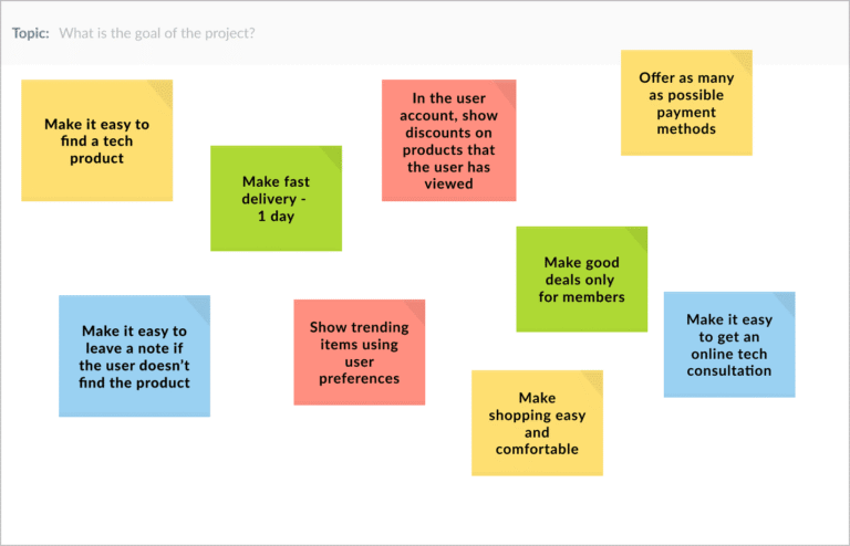
UX Goals & Strategic Priorities
A strategic discovery process helped align user needs with business goals. The resulting UX objectives guided all design decisions:
- Simplify product discovery with intuitive navigation
- Build trust through clear structure and transparency
- Personalize experience with smart filters and tailored offers
- Support quick decisions with fast delivery and expert consultations
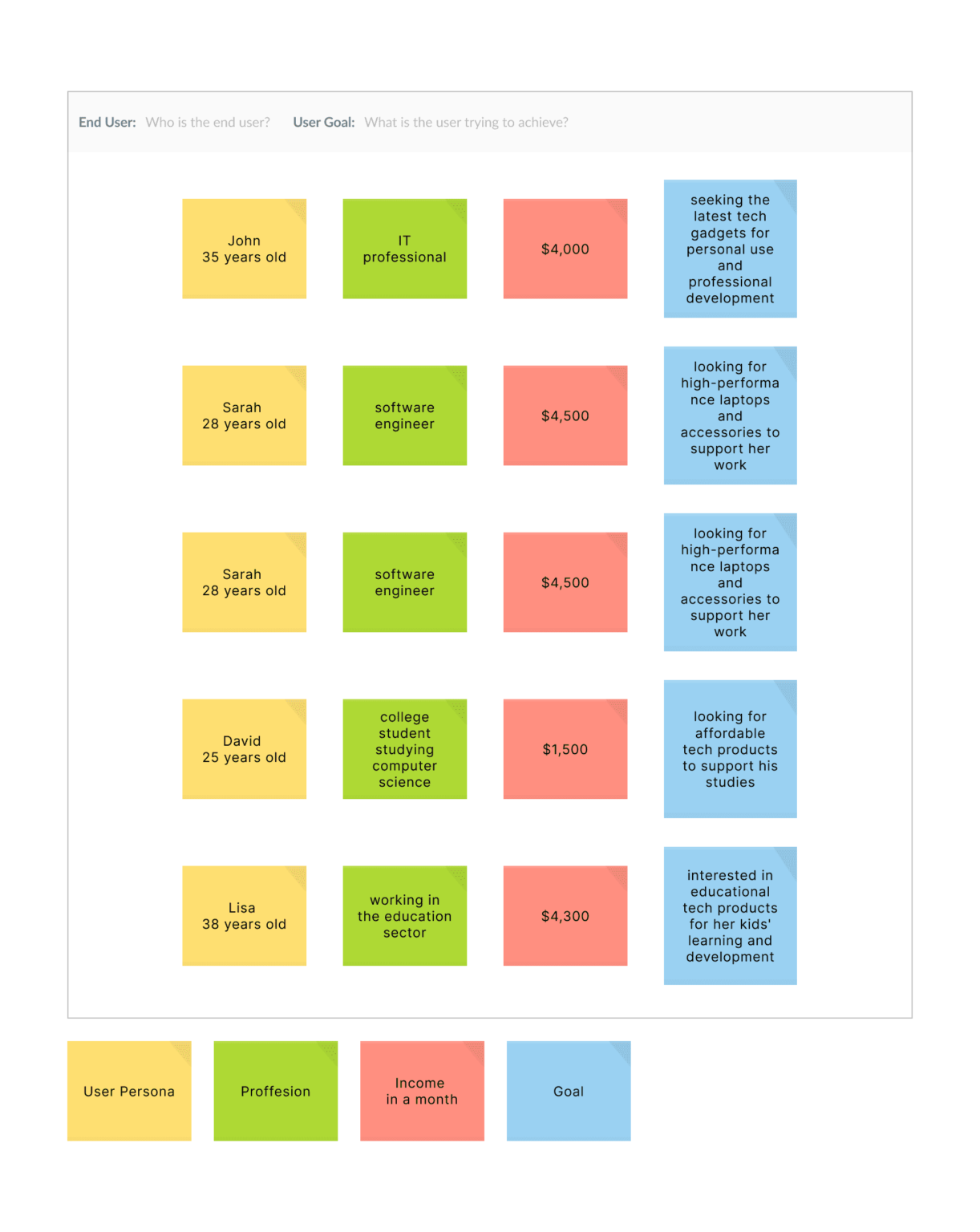
Customer Needs Mapping
Understanding user context was key to creating tailored flows. By mapping personas across profession, income, and purchase goals, distinct behavioral patterns were revealed—guiding content hierarchy, product recommendations, and feature prioritization.
User flow and Wireframes
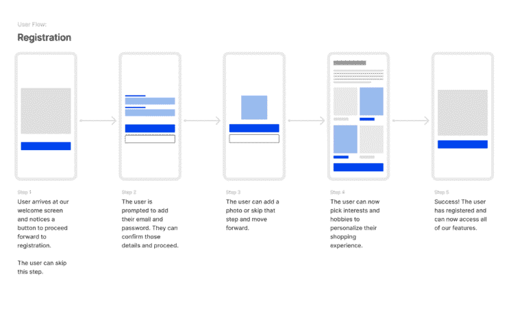
Conversion-Focused Flow
The onboarding flow was designed to minimize friction while collecting key user information for personalization. Each step focused on clarity and optionality to reduce drop-off and encourage successful registrations.
Key UX considerations:
- Reduced cognitive load with one action per screen
- Visual progress indicators to build confidence
- Option to skip steps for faster completion
- Embedded personalization triggers (e.g. interest selection)
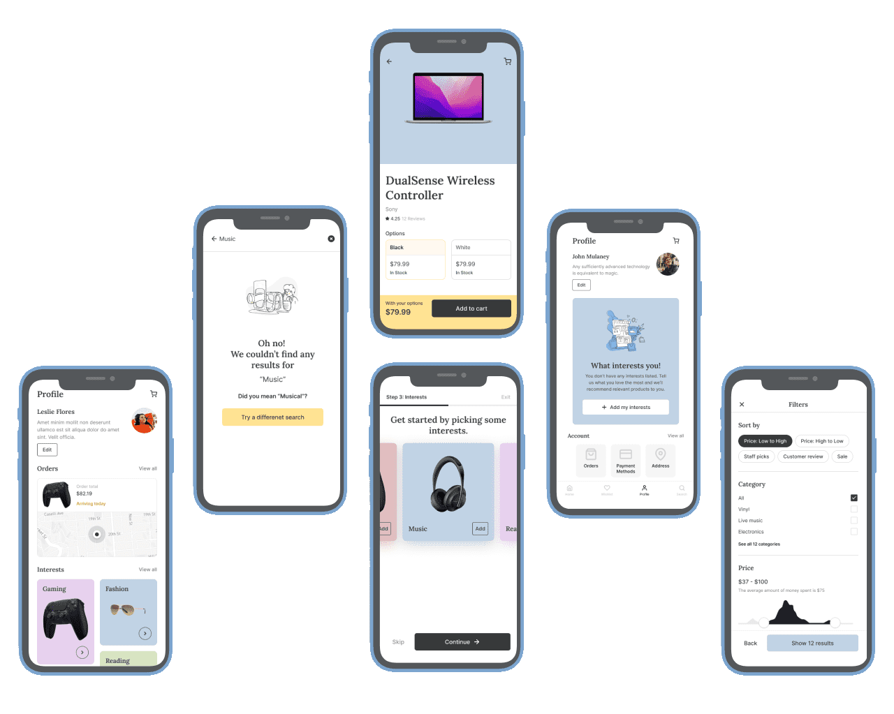
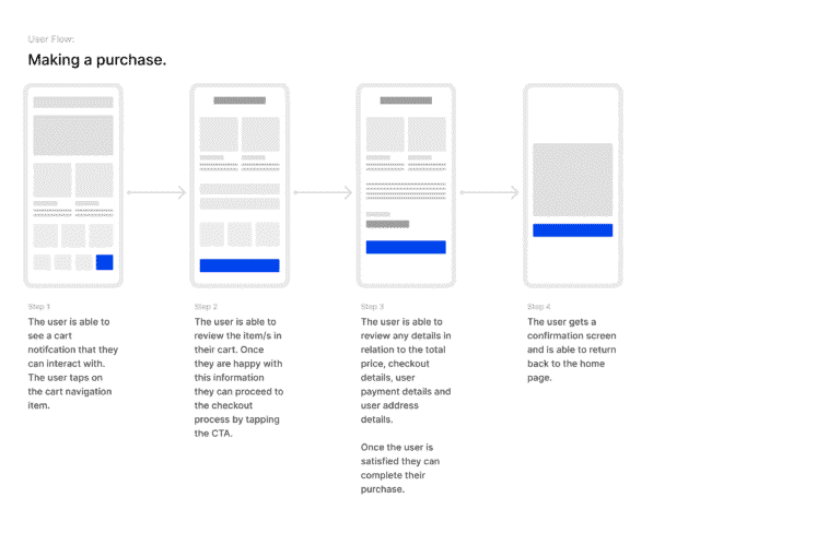
Purchase Journey
The checkout experience was optimized for speed, clarity, and trust—critical to reducing cart abandonment and increasing conversion rates. Each step was structured to minimize friction and support confident decision-making.
Key UX considerations:
- Clear cart summary with editable details
- Streamlined multi-step flow with minimal distractions
- Secure design patterns to reinforce trust
- Smart defaults and auto-fill options to reduce effort
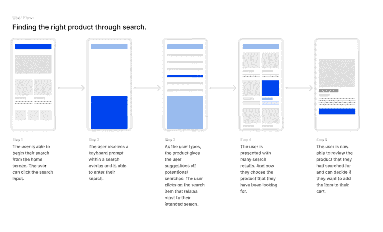
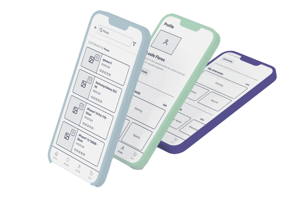
Product Discovery via Search
The product search flow was crafted to deliver fast, relevant results with minimal input. It prioritizes clarity, speed, and smart guidance to help users quickly find what they need.
Key UX considerations:
- Smart suggestions triggered as users type
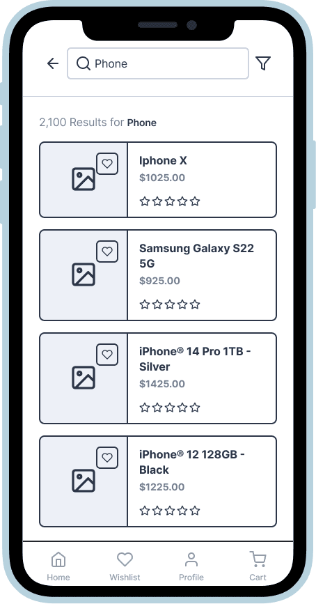
- Clean layout of results for quick scanning
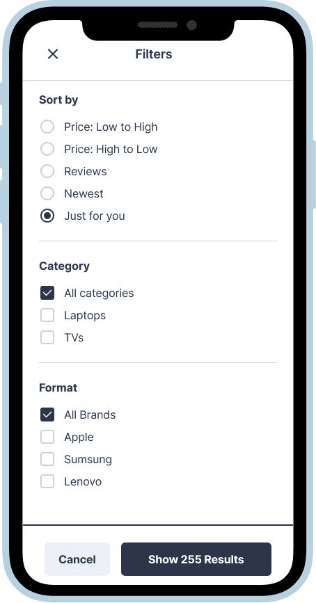
- Easy filtering to narrow down options
- Clear product info to support confident selection
Wireframes to Shape Key Flows
Early-stage wireframes were created to map and validate essential user journeys—from browsing and filtering to adding items to cart and proceeding to login. The focus was on structure, clarity, and alignment with user behavior.
Highlights:
- Clear layout for quick product comparison and selection
- Frictionless cart and sign-in entry points
- Thoughtful flow organization to support decision-making
- Wireframes used to align stakeholders and test core logic before visual design
These wireframes laid the groundwork for a smooth, focused user experience.
- Results
Project Summary
The app redesign focused on enabling confident product decisions with minimal effort. Each interaction was optimized to reduce friction and empower users—from comparison to purchase.
Key Focus Areas
Products are displayed with clean hierarchy, easy-to-scan pricing, and availability info to support instant decision-making.
Added/active states, call-to-actions, and in-stock indicators help users stay oriented and reduce drop-off.
Flows were refined to eliminate clutter and simplify navigation across filtering, selection, and checkout.
- 35% faster task completion in user testing
- 2× increase in feature discoverability (search, category filtering)
- 22% boost in user retention after 30 days
- Positive qualitative feedback on clarity, ease of use, and visual appeal
Approach
Focused on clarity and flow—design decisions were informed by quick validation loops and refined based on user insights.
Contribution
Handled end-to-end UX/UI—from research and user flows to wireframes, visual design, and prototyping.
What Changed
- 35% faster task completion
- 2× boost in feature discoverability (filters, sort, reviews)
- 22% increase in retention after 30 days
- Strong user feedback on visual clarity and ease of use
Let’s Talk
Partner with a designer who understands your users — and always delivers on time.