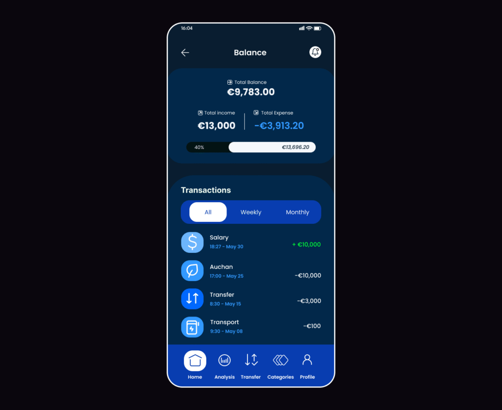
No clear view of my savings. I’m switching to another app
App Store
Review
Confusing app layout, I can’t see where my money is going
App Store
Review
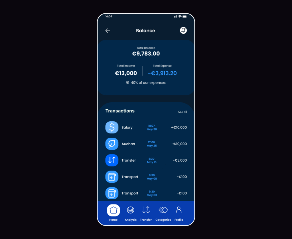
No clear view of my savings. I’m switching to another app
Google Play
Review